 Whatsapp


The 2024 Lincolnshire Business Excellence Awards are now open for nominations, seeking to spotlight outstanding businesses within the Greater Lincolnshire area.
Hosted by Stonebow Media, the publisher behind The Lincolnite and the MyLocal platform, this prestigious event is designed to honour the achievements of the regional business community.
Thanks to the headline sponsorship from the University of Lincoln Enterprise & Research department, the Lincolnshire Business Excellence Awards are a unique opportunity to acknowledge and celebrate the contributions of local enterprises.
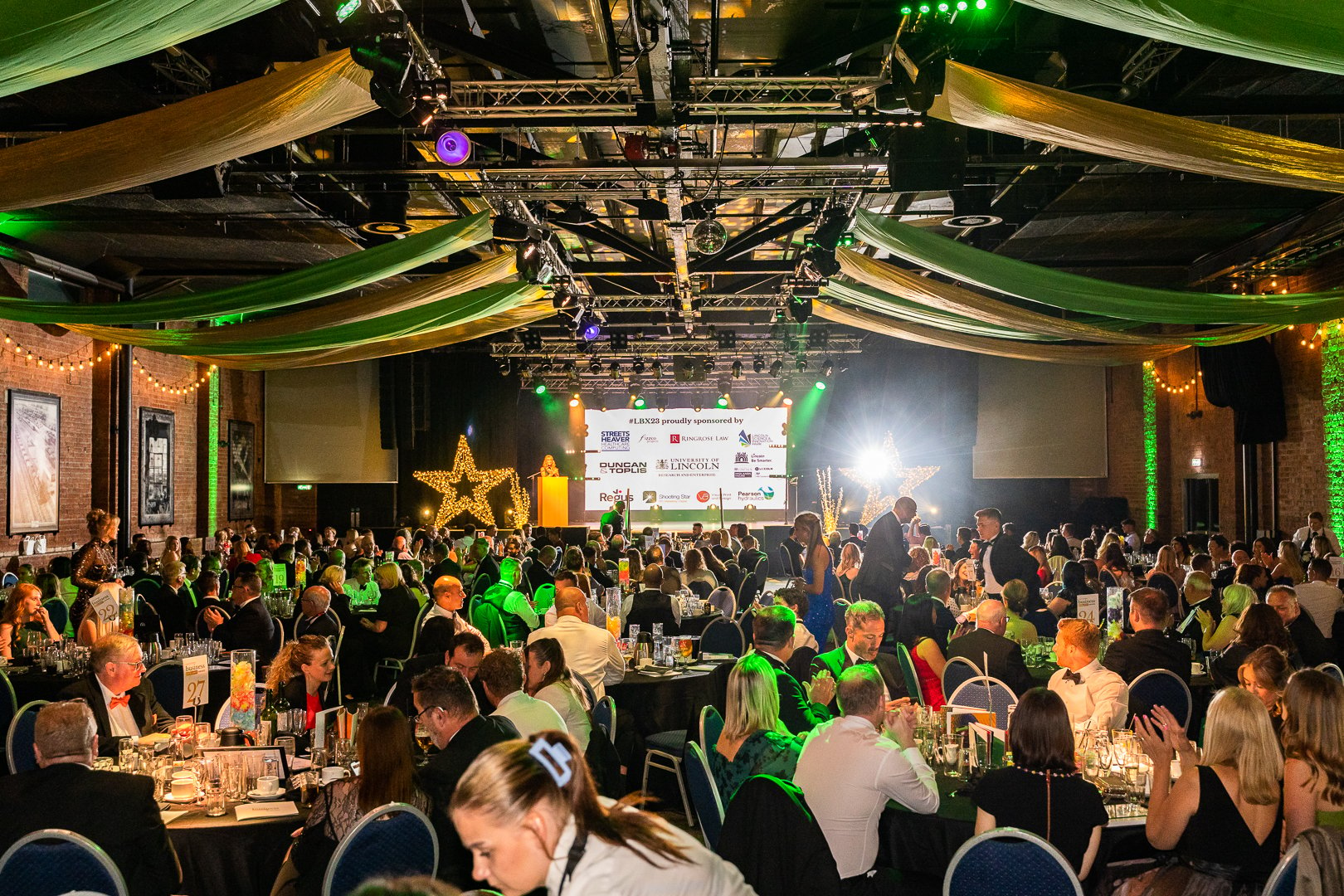
The awards are also sponsored by Ringrose Law, Duncan & Toplis, Sills & Betteridge and Pearson Hydraulics. A small number of sponsorship opportunities remain available. Contact [email protected] to discuss partnerships.
Businesses can nominate themselves across eleven awards categories:
- SME of the Year
- Family Business of the Year
- International Business Achiever of the Year
- Business Innovation/Innovator of the Year
- Emerging Business of the Year
- Charitable Business of the Year
- Environmental/Sustainable Business of the Year
- Rising Star of the Year
- Business Leader of the Year
- Business of the Year
- Tech Business of the Year
Nominate now! Entries open on the Lincolnshire Business Excellence Awards website.
The deadline for nominations is May 24, with the judges’ deliberation lunch set for May 29. The judging panel includes business experts and professionals from Lincolnshire and event sponsors.
The Lincolnshire Business Excellence Awards 2024 gala will take place at the Engine Shed on July 12, 2024.
For more details on the categories, sponsors, and judges, visit the Lincolnshire Business Excellence Awards website.
Reasons to enter:
- Enhance profile & credibility: Securing an award or being shortlisted acts as a powerful endorsement, signaling trustworthiness to potential customers and helping to distinguish your business from competitors. Displaying the award on your communications can significantly boost your brand’s perception.
- Insightful focus & feedback: The application process encourages deep reflection on your business strategy and direction, offering invaluable feedback and clarity, even for new ventures.
- Team confidence boost: Recognition from the awards can significantly uplift your team’s morale, affirming the value and potential of your business in the eyes of industry experts.
- Marketing & PR boost: Being associated with the awards, even as a nominee, can enhance brand visibility, providing ample content opportunities for social media and other marketing channels.
- Networking opportunities: The awards connect you with local business leaders and experts, offering a platform to seek advice, share ideas, and foster future partnerships. The ceremony itself is an excellent occasion for networking with peers and celebrating mutual successes.
- Potential to win: Entering offers a chance to win and gain all the associated benefits, but even without taking home a trophy, the process can yield significant advantages for your business.