The festive season has begun, and no doubt you’re all braving the crowds to find the perfect presents and writing out your season’s greetings to family and friends, but there is one Christmas list you shouldn’t forget – your business’.
Here at Lava, it has become an annual tradition to send our clients and friends a fun card to wish them a Merry Christmas (who remembers the Lava Penguin of 2013?) because as well as spreading festive cheer, it also shows clients they’re important to you and it’s a great way to build up relationships.
What’s more, it can also be a subtle way to market your business. Not only are they an understated way to remind past, present and potential clients about you, if they’re well-designed and quirky enough the recipients may share them on social media. Last year, Jeremy Vine tweeted a picture of the Lava Penguin he’d made in the BBC Radio 2 studios!
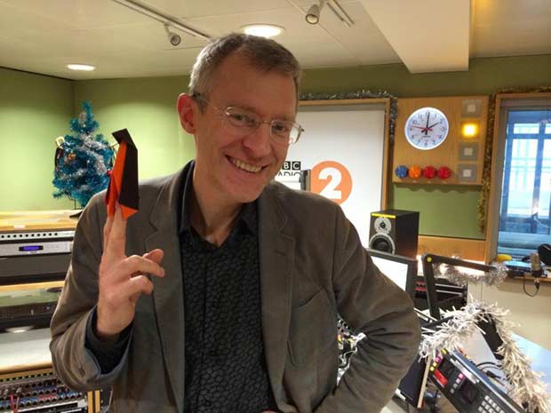
Jeremy Vine and his Lava penguin last year.
To help your business get noticed this year, I’ve put together five top tips to help your Christmas card stand out in the crowd.
Be original
Creating a bespoke card that is designed and illustrated in a way, which is personal to your company will ensure you get noticed and remembered. It also shows the people that you care and value their custom.
Don’t go digital
Although we now live in a very online world, the classic Christmas card should always be signed, sealed and delivered – the traditional way. An e-card can be easily deleted once read or be lost in the sea of emails we get daily, whereas a printed card received in the post is more than likely going to be read, appreciated and put on display throughout the festive season.
Remember your branding
As I mentioned before, your Christmas card will more than likely be put on display in the workplace, so it’s important that it’s branded in your company’s colours and house style with your logo, so as soon as anyone sees it, they immediately think of you.
Humour goes a long way
A funny card that makes someone laugh will always be remembered over a generic card, so have fun with your designs! Just remember to stay tasteful and avoid anything that could be taken as offensive.
Make them personal
Always personally sign each and every card and if you know the recipient well, include a handwritten message, because it shows your appreciation, helps build loyalty and strengthens relationships that a printed name just wouldn’t do.
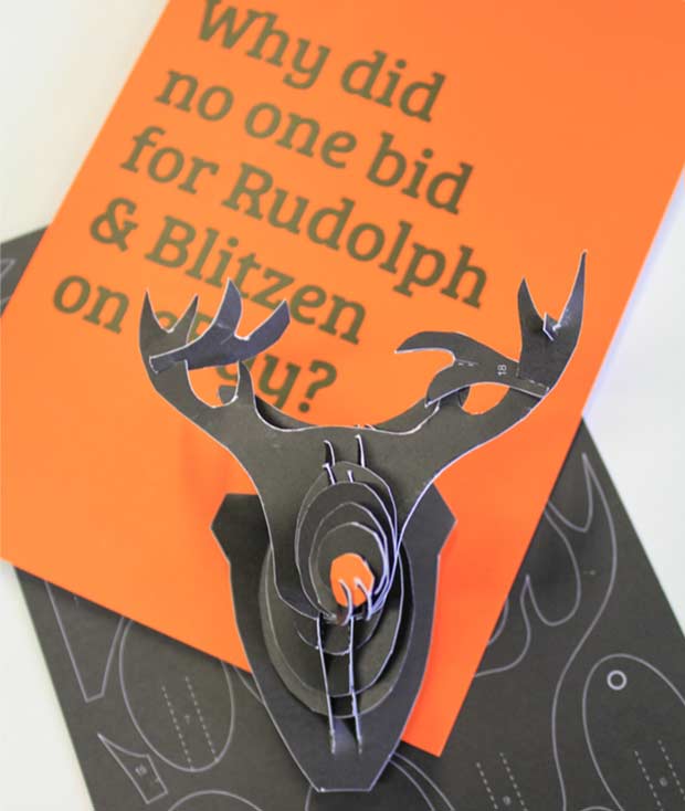
The Lava reindeer recipients can make this year.
Does your business send out annual cards? I’d love to see pictures of your designs, tweet me @WeAreLava
Lisa Yates is the design manager at Lava, an award-winning marketing agency in Lincoln.